Case Study: Schiff Dental
responsive dental office website
Role : UX/UI Design, Brand Design
Introduction
Prior to becoming a UX/UI designer, I worked as an office manager at a small local dental office. When I wasn’t booking appointments or putting out fires, I dabbled in design and had created a website and “fancy” facebook banner for the office. Their site wasn’t much in terms of looks, but it provided the necessary information and images you look for on a dental office’s site. Here we are 4 years later and I have redeemed my prior efforts by designing a responsive website and re-branding Schiff Dental.
The stakeholders had recently renovated the office to new clean modern aesthetic and wanted to have their website reflect this big change. One of the stakeholders primary concerns is obtaining new patients, and they want to appeal to the younger generation that is moving into the local area. Finding a new Dentist isn’t always the easiest or most enjoyable process, but our goal was to design a site that was friendly and informative for potential new patients to visit.
The original Schiff Dental website: Homepage.
Patient Info
Research
I started this project by exploring the current dental site for Schiff Dental. The site had been built by my partner for his computer science portfolio to show his knowledge of HTML and Javascript, so the UX was great for how quickly we built the site. The UI and branding was my contribution and I had done my best to create an attractive and useable site. I knew I needed to see how other successful dental offices presented their websites, so I did a competitive analysis between smaller local dentists and large dental service providers.
I still didn’t have an exact idea as to what people look for on a website for a dental office, specifically when looking for a new dentist. I then conducted two slightly different surveys, one was catered to only current patients of Schiff Dental and another geared towards non-patients of Schiff Dental and generally any demographic/age.
The results of the two surveys are quite different and surprising based off my assumptions. About 50% of the current patient survey’s participants were over the age of 55. While on the non-patient survey, 73% of participants were under the age of 35. This age difference lead to some interesting differences in what people look for. For example, 80% of the younger non-patients would find it very helpful to have accepted insurances and payment options listed, and less than half of the older current patients would prefer to see these listed. This could be that the older current patients know they have a stable income and possibly a reliable insurance plan and the younger non-patients are more cautious.
Branding and Identity
When it came to re-branding Schiff Dental, I wanted to focus on making the site feel friendly and approachable for potential new patients. I drew inspiration from their newly renovated office and the resort beach town in which the office is located. The beach is a large part of everyones lives in this area, so I wanted to emulate that into a modern and sophisticated UI aesthetic for the site.
UX/UI Design
Since the main goal of redesigning and rebranding the site is to bring in new patients to the office, I wanted to make sure the site was easily navigable for anyone. Once I had established a persona, and determined the user flow, I began building out the pages that a new patient would find helpful. All of the results from my research were being put to use here, and I was able to organize everything into wireframes.
Homepage, New Patient, Our Office
Services, Contact, Booking page and booking confirmation.
Homepage
Shown here is a sticky nav bar and a hero illustration which I designed. My goal with the illustration was to create a fun and dynamic banner that welcomed users.
The middle of the Homepage displays three main points that encompass Schiff Dental and what they provide as a general dentist. There is a CTA which directs the user to a list of services that Schiff Dental offers. The banner image was taken in the Hygienists operatory.
The bottom of the page displays the location, hours and two ways to contact the office. There is a floating carousel of four testimonials from real reviews left by kind patients of Dr. Schiff.
New Patient
I focused on four main elements here, easily downloadable new patient forms, providing payment options and dental insurance information, and a form for questions that is sent in the form of an email.
Booking
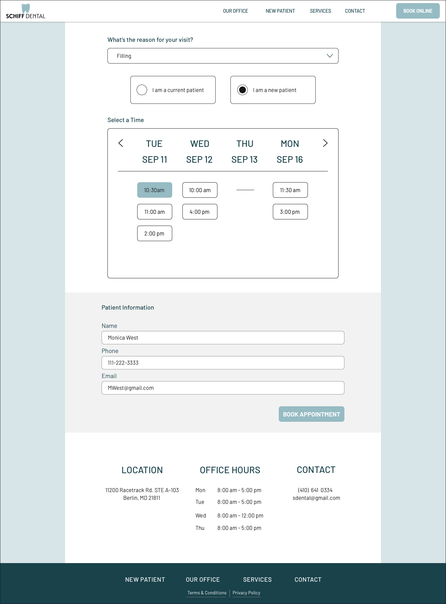
Here I designed a calendar style element for booking an appointment online. There is a drop menu that displays a list of services that are bookable online. The goal was to make this process as easy and intuitive as possible by using elements that are familiar. Once an appointment is booked, a confirmation page is displayed stating the time and date of the appointment.
Final responsive UI Wireframes
Homepage web, tablet, mobile.
New patient web, tablet, mobile.
Booking page web, mobile.
Reflections
This project is far from over for me, my next steps will be to build out the rest of Schiff Dental as a full website. I will continue to work closely with the stakeholders on this and I’m looking forward to seeing my designs in real, working form. I would have enjoyed designing more of the site in its current state, had I been allotted more time for this project.
Overall this project has required me to think more empathetically about the users experience. Dentists aren’t at the top of everyones list of favorite people to visit, so the purpose for this site was to create a welcoming and friendly visual aesthetic. I prioritized easily visible information about what Schiff Dental offers and who they are as oral health care providers as soon as you visit the site. I chose to do that so that the potential new patient browsing Schiff Dental can spend more time booking their appointment rather than hunting for basic information about the office.


