Case Study: MIRROR
A responsive e-commerce clothing site
Role : UX/UI Designer, Branding
Introduction
Mirror is a sustainably affordable and diverse clothing store which is already very successful with over 400 stores around the world. Mirror is a bit behind and does not currently have an e-commerce site for customers to shop for clothing online. They want to give Mirror a face-lift by changing the logo and any branding. My goal is to help them refresh their current image while also designing a fully responsive website that allows new and current customers to have a memorable experience while shopping for clothing online.
Research
To help Mirror gain a better idea of what users look for when shopping online, I began with market research, so that I can become familiar with e-commerce sites as well as past and current statistics.
Competitive Analysis
After I built some background knowledge I was ready to do a Competitive Analysis of four similar companies to Mirror and two larger e-commerce companies that don’t necessarily focus on clothing sales. I focused on different strengths and weaknesses of each company.
Interviews
I interviewed 5 participants within the determined demographic for Mirror that was found from my secondary research.
Participants: 5
Gender: 2 Female, 3 Male
Age: 20-55
Summary
All of the participants value easy navigation and quick check out.
Most participants are concerned with being able to find clothing in their size.
Most participants are interested in sales and promotions.
Free shipping is desirable by all participants
Persona
I had learned so much from my interviews so I organized my results into an empathy map, and Mirrors persona, Sasha Frou, was created to help us understand the potential buyers pain points and goals when shopping online for clothing.
Storyboard
I needed to understand Sashas pain-points and needs better, so I created a detailed Storyboard. This allowed me to think like a potential shopper on Mirror’s new website and be more empathetic.
Information Architecture
I was ready to start mapping out what should be included on the site and what the homepage should look like.
Site Map
I was able to create a site map for Mirror. The detailed site map, along with a few quick sketches of the homepage to show to Mirror for their approval, really allowed me to envision what their site should include for the best user experience.
Sketches
Interaction Design
Task Flow
This task flow was a great way for me to see step-by-step how a user would get from the homepage, to selecting an item, adding it to their cart and then checking out. When you are shopping on a well designed site, you aren’t aware of all of the steps you take to complete an order. This process also helped me get ready to create my responsive wireframes to show Mirror and get some feedback.
Responsive Wireframes
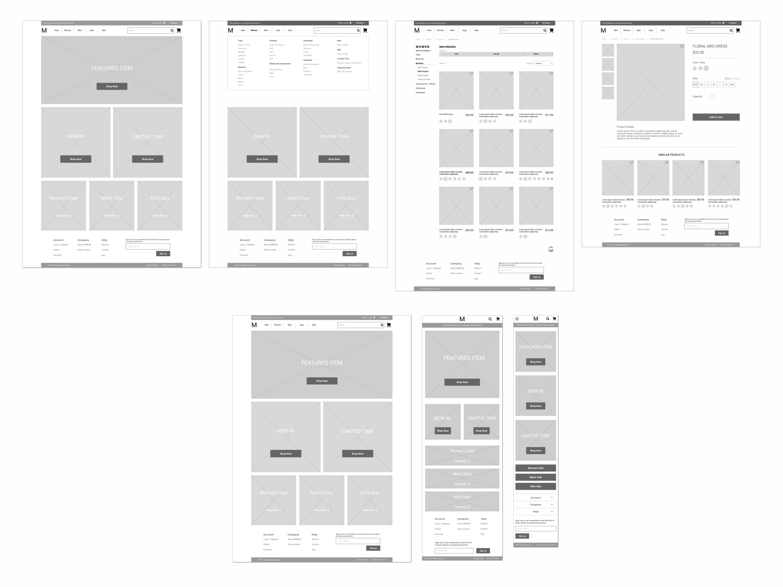
I designed the responsive wireframes for the check out process that I showed in the task flow, so Mirror could see the process through a realistic example. Since their new site will be fully responsive, I also designed the homepage for tablet and mobile screens. After some iterations requested by Mirror, I was able to create a low-fidelity prototype in Invision so that they could interact with elements on the site.
Branding & UI Design
Style Tile
The rebranding of Mirror was my favorite task, considering how important it was to the company, and it was fun developing Mirrors new aesthetic. Based on various adjectives that represent Mirrors new brand, such as modern, and mature, I created a simple color palette that is versatile and approachable. The logo is a play on the literal meaning of Mirror while having a clean modern look. The goal with the rebranding was to have Mirror stand out as an e-commerce clothing site but also follow current design trends that will aid in growing their online presence.
Final Responsive UI Wireframes
Affinity Map
Despite only having 4 people volunteer for user testing, I was still able to collect some interesting results. The task was to locate an item, women’s midi dress or mens pants, and select a size and add it to the cart. I was glad I that all of the the participants were able to complete the task I had set. One very successful pattern that occurred for each participant is that they located the navigation bar easily and knew to hover over Women or Men to see the categories. I knew that this is a design pattern used in most e-commerce clothing sites and would increase the users experience when shopping.
Reflection
If I had been given more time to complete this project, I would have enjoyed designing the rest of the site. The checkout page is what I would have tackled next, seeing as it’s an important element to e-commerce sites. I also think that introducing edgier designs, like incorporating textures and playing around with the layout and ui transitions, could make the user experience of Mirror even more appealing.


