Case Study: Forge World
Ecommerce Website Rebranding
Role: Graphic Design, UX/UI Design
Introduction
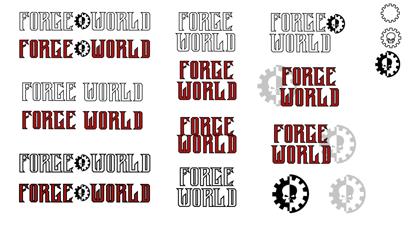
A Digital Design project while attending ASU assigned me to complete a branding campaign for a company of my choosing. I chose to address the ecommerce site for Forge World, a subsidiary of Games Workshop. The problems that I addressed were to improve the cohesiveness of the colors, improve the appearance of the logo, and modernize elements across the site. I solved these by defining the Forge World branding apart from Games Workshop to enhance user experience. I also redesigned the Forge World logo with a new font and new colors for all CTAs.
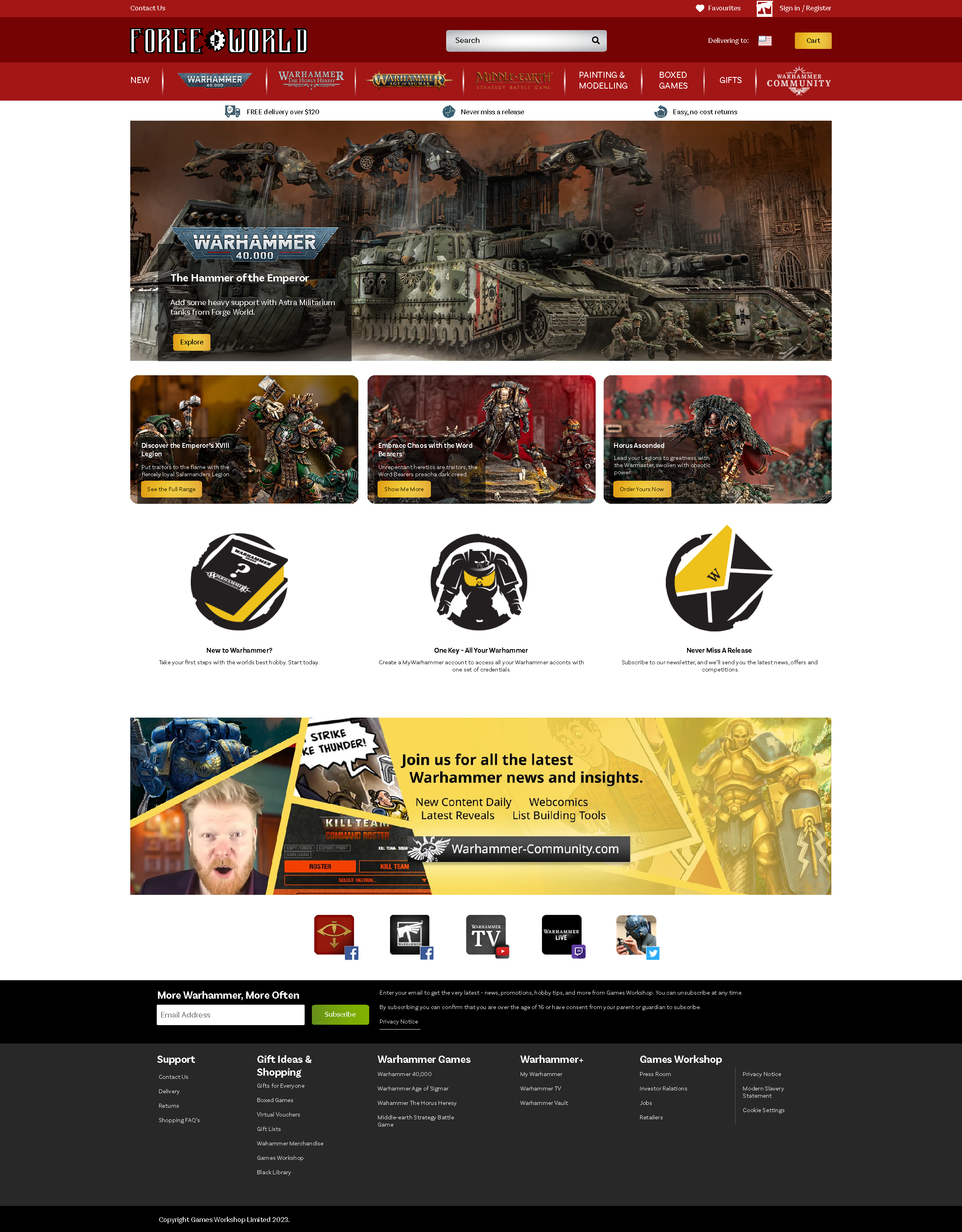
I chose to rebrand Forge World’s ecommerce site because I as a patron I use the site and have encountered the lack of personality this site has in comparison to its parent company. The two companies appear detached and lack the feeling of one unified brand. Games Workshop launched Forge World in 1998 to replace a company that was casting resin models for them. The launch of Forge World allowed Games Workshop to save on costs by casting models in-house as well as offer exclusive models only found through Forge World.
Project Brief
A rebranding of the ecommerce site for Forge World, a subsidiary of Games Workshop. The main goals were to improve the color cohesiveness, appearance of the logo, and modernize elements across the site. These problems affected the cohesiveness of the site as well as differentiate Forge World from Games Workshop. The logo for Forge World looked out of place, and the font and type choice will be improved to match the brand better.
The Warhammar community is composed of all gender identities and ages. The ideal persona is an individual who is interested in fantasy role playing and/or crafts and collectables. Due to the maximalist tone of the brand, the hobbyists would find interest in highly detailed images, bold colors, an accessible ecommerce site, and a memorable and unique logo. The rebranding project will consist of a redesign of the UI elements on the existing website, a new logo to represent the brand as well as new colors, and a style guide to clearly show the new branding guidelines for the company.
Information Architecture
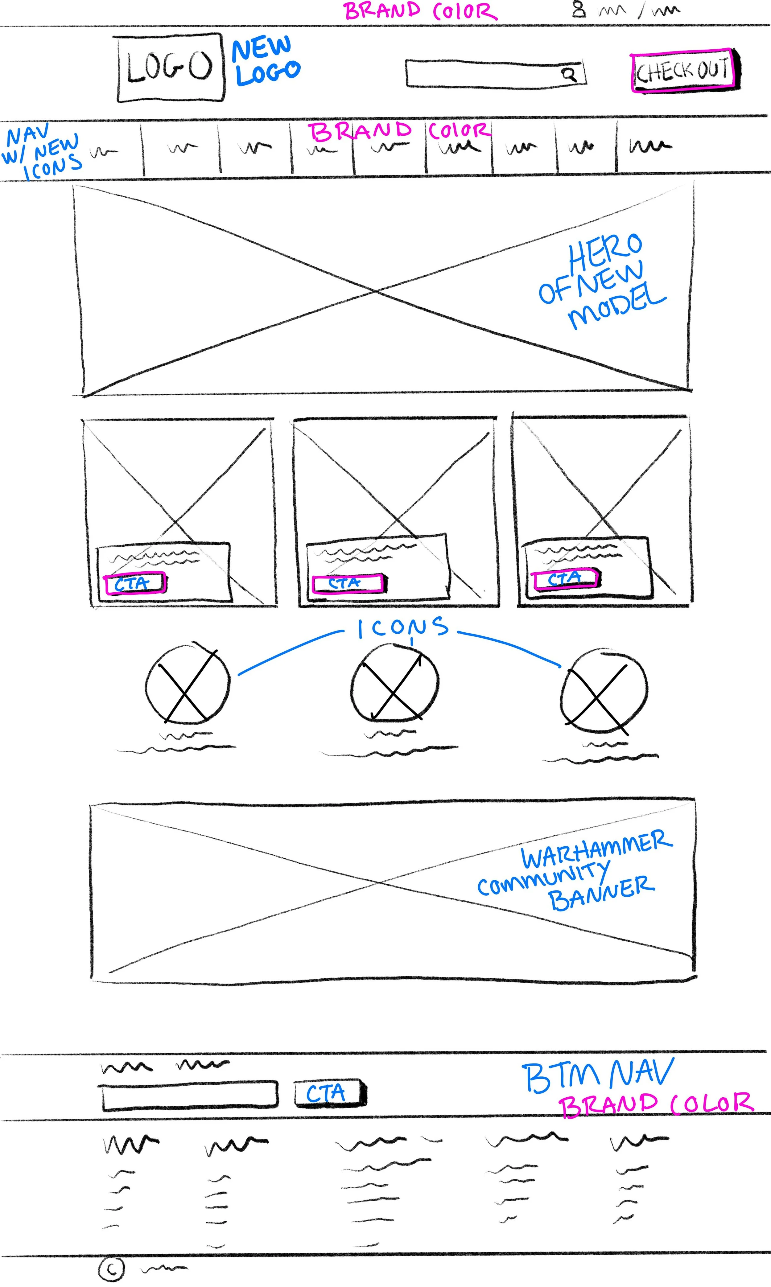
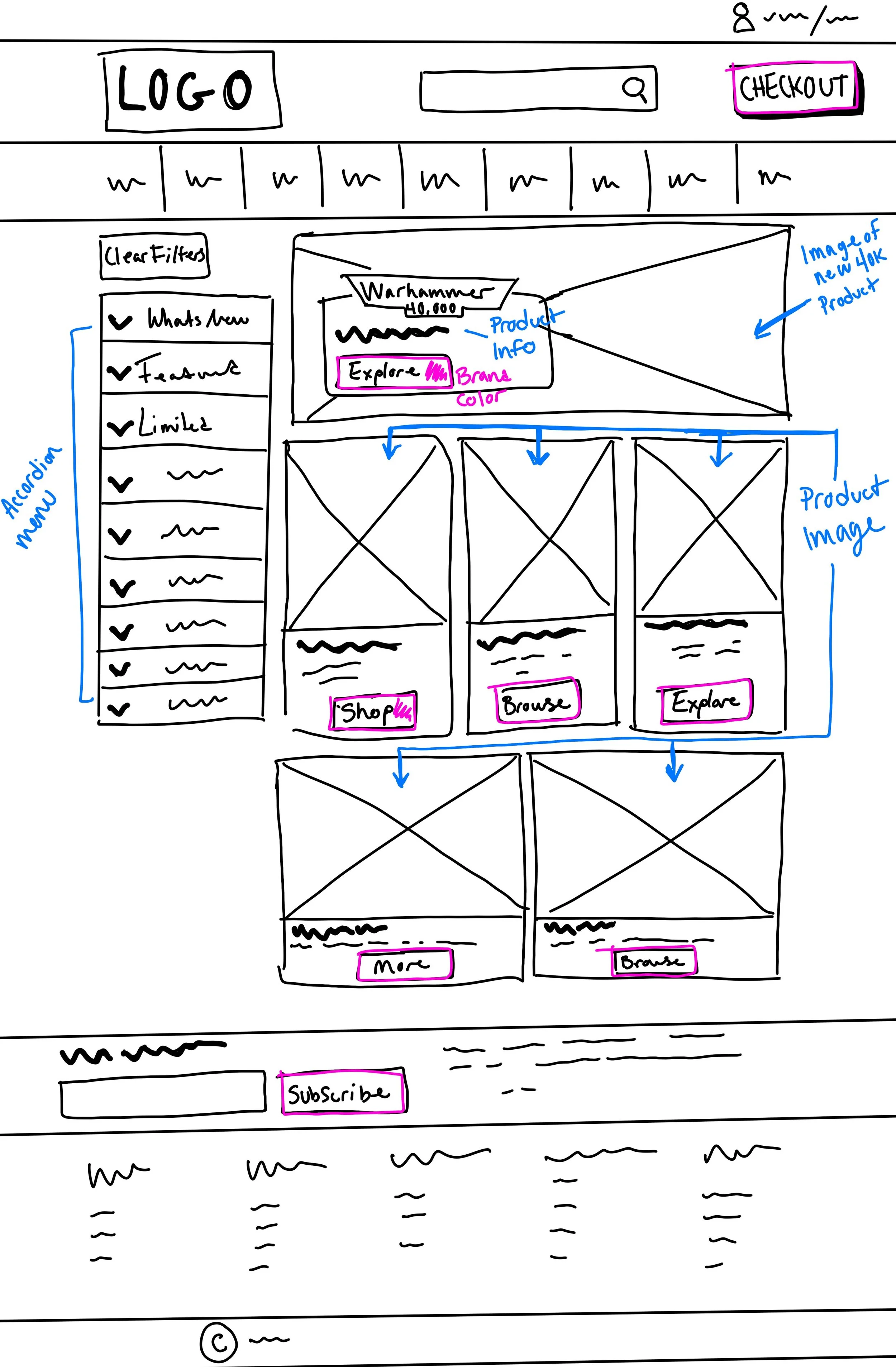
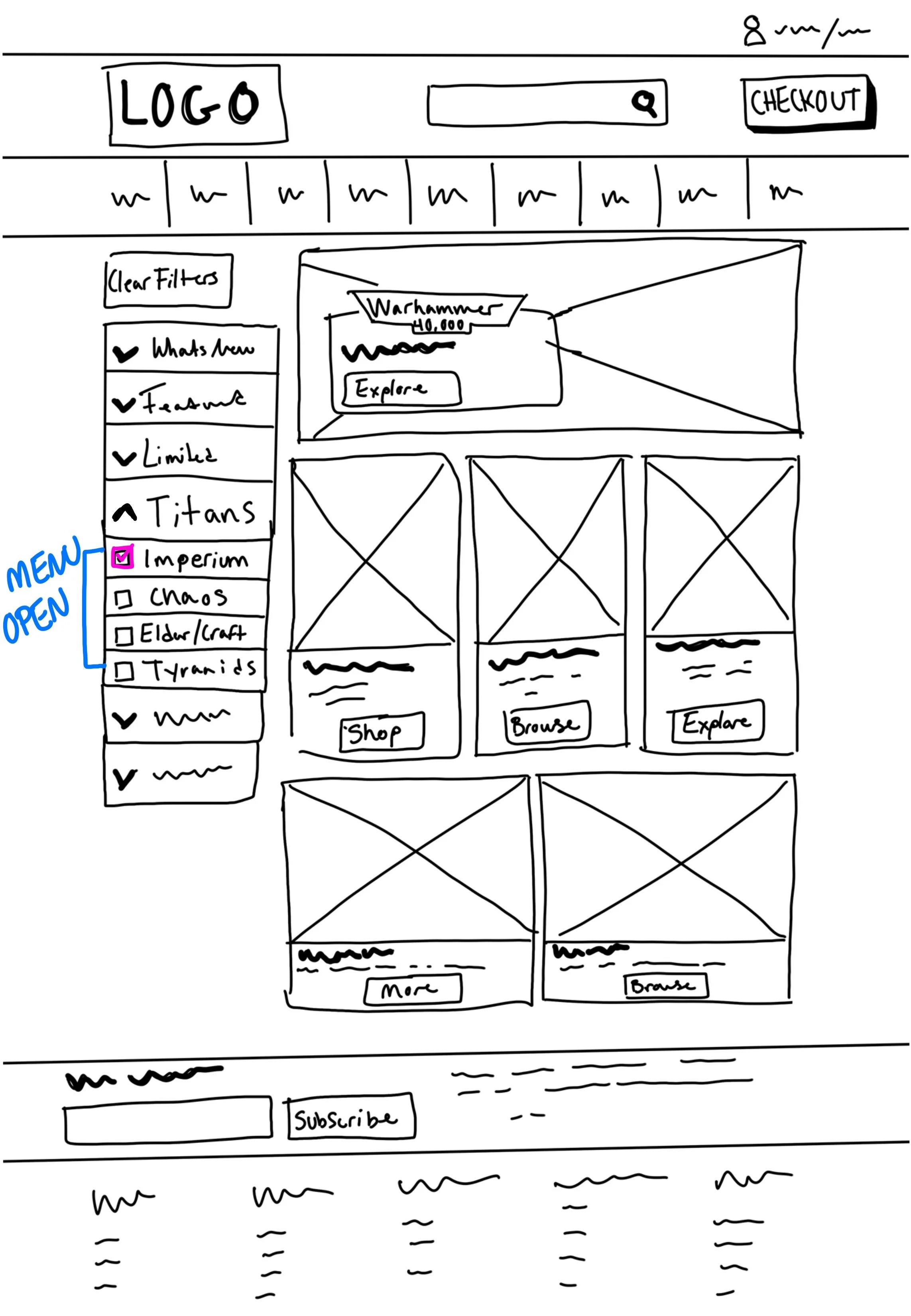
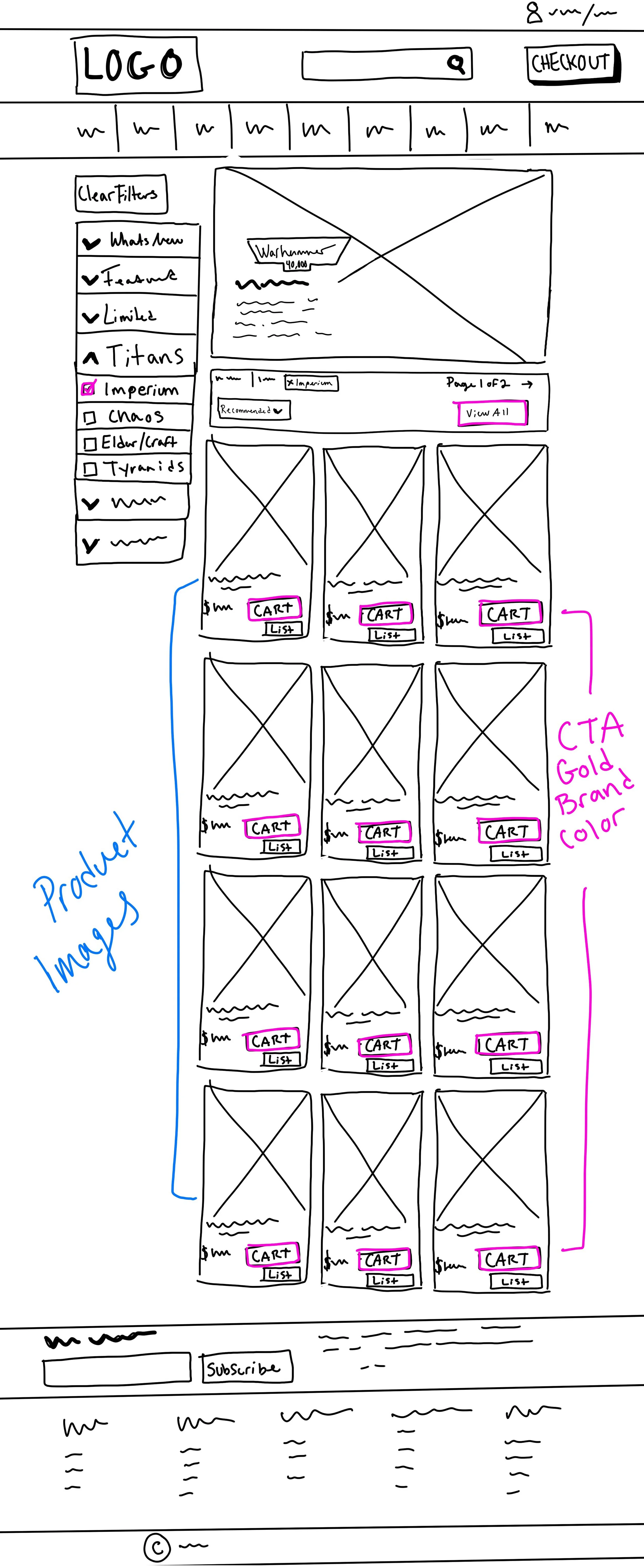
Wireframe sketches thought process
Homepage
The homepage layout is similar to the original site but with clearer hierarchy. I moved the checkout/cart to the top navigation bar instead of it sticking to the bottom of the viewable area. This follows a common design pattern for maximum user retention and ease of user task flow.
Catalog
I wanted to make sure the highlight colors used for the CTA stand out more in these new designs for the catalog. Maintaining a strong visual hierarchy on this page is important, I don’t want the user to become overwhelmed but I also want to highlight possible avenues when browsing the site. These avenues include things like new products, news and events, and other promotional imagery and text.
Catalog Filters
When applying product filters I wanted to keep the accordion style menu that was used in the existing site. I feel that these menus are ideal for ecommerce sites that have categories with one or more subcategories nested in the menu. These menus work well for responsive design. The user is able to see the hierarchy when executed properly, thus resulting in more successful outcomes when browsing and shopping.
Catalog Filter Results
For the product results I stuck to a common card grid layout but emphasized the use of the new highlight colors on the CTAs here.
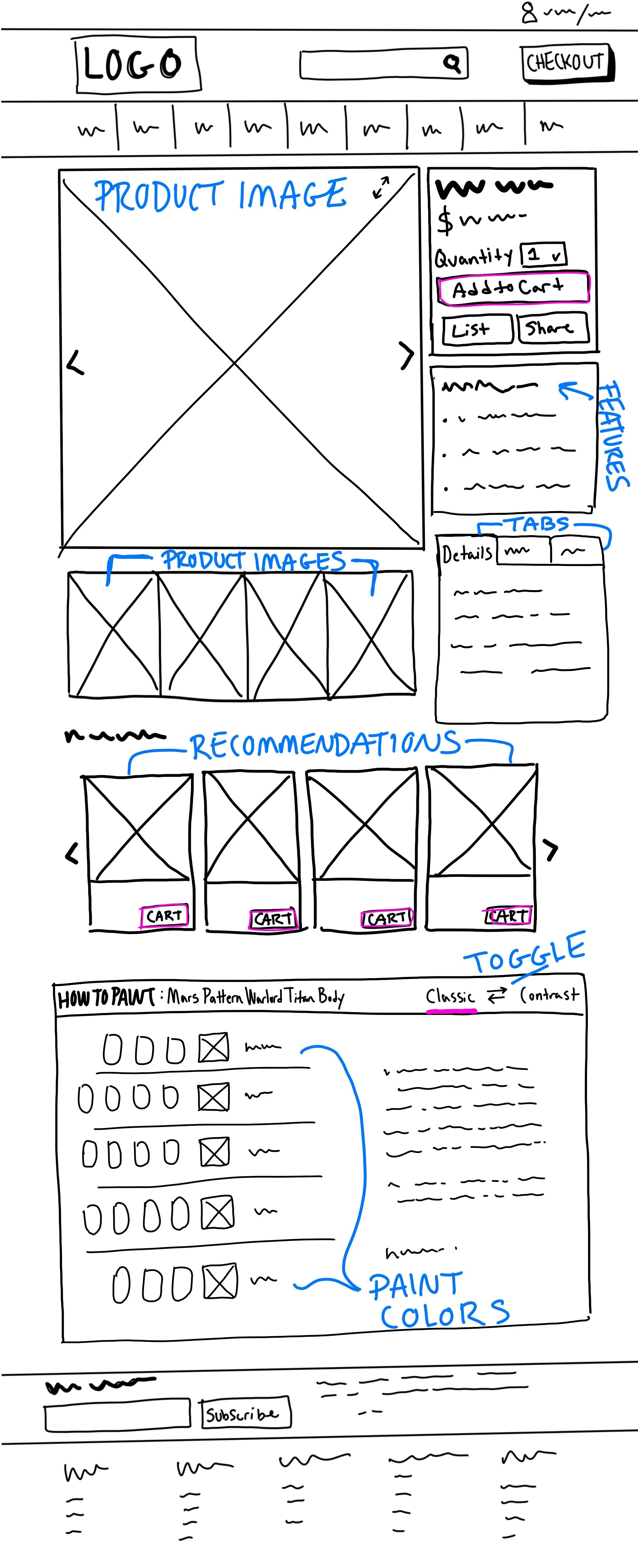
Product Page
The product page prioritizes product imagery and relative product information first. Followed by recommended items and helpful information.
Branding
Mood Board
I created a mood board to aid in the representation of Forge World and Games Workshop. Identifying similar colors, imagery and theme allowed me to settle on a new tone for the Forge World site. The existing site was flat, cold and lacked emotion.
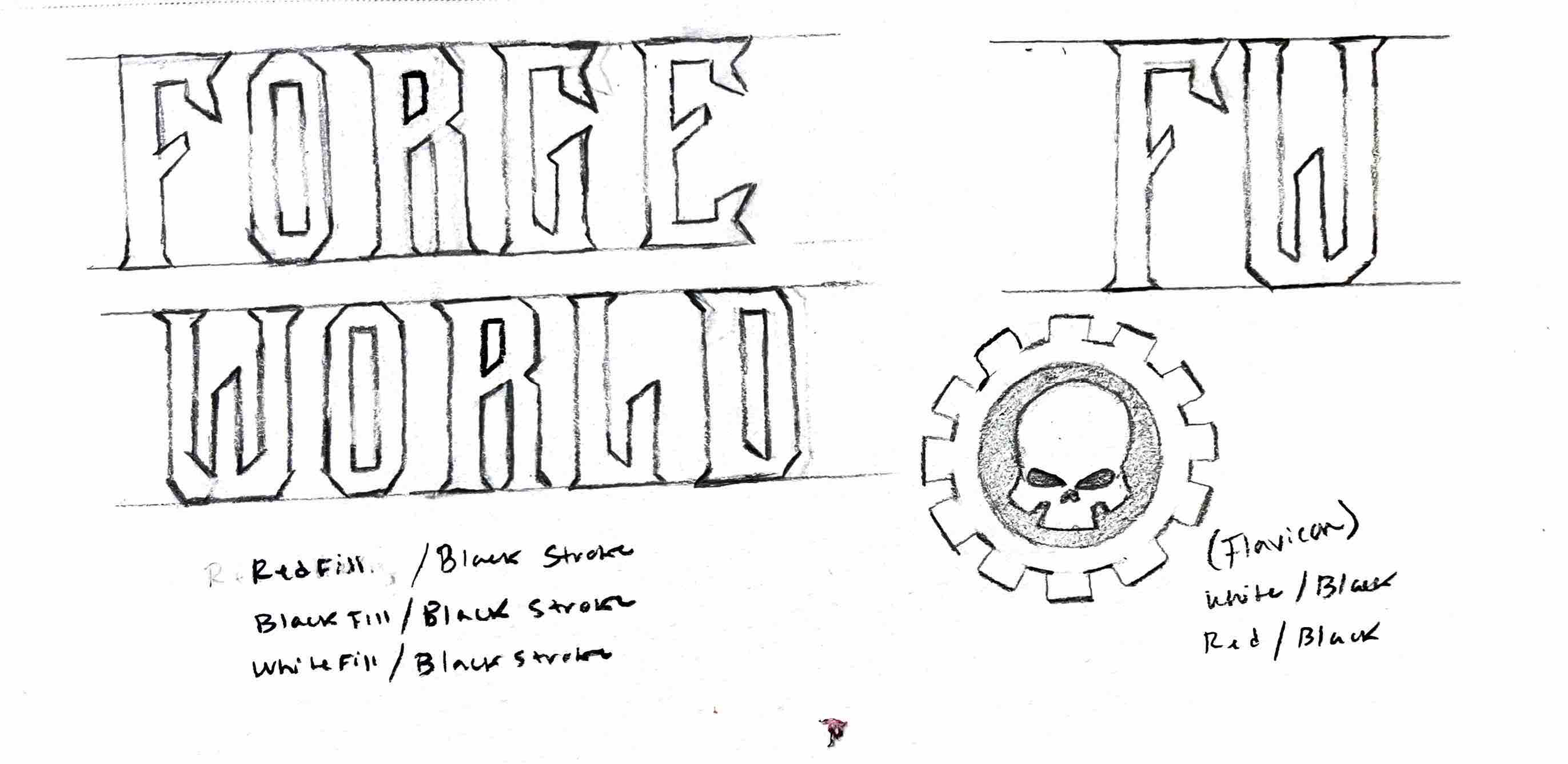
Icon Sketches
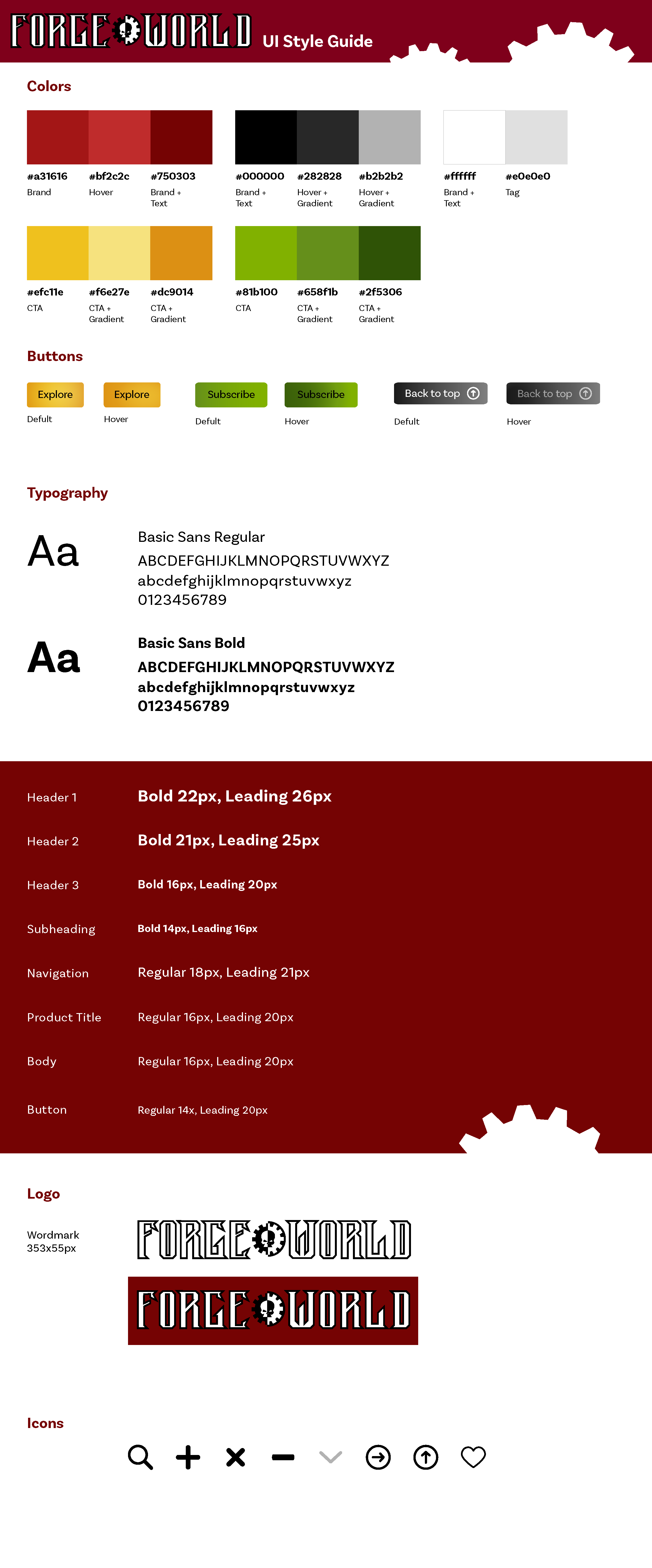
Style Guide
Final UI Wireframes
Reflection
This project allowed me to be creative while rebranding but challenged me to make sure that the new Forge World branding aligns with its parent company, Games Workshop. This was a fun challenge and I feel I did well, aside from the good grade I received.
Since completing this project Games Workshop has “dissolved” Forge World and the stand-alone ecommerce no longer exists, unfortunately. Instead of defining the two brands, they have chosen to combine them and only maintain the one brand, Games Workshop. If the two brands were to stay separate, I feel that my rebranding would allow them to stand on their own while also feeling cohesive.


